

I don’t think I can ever remember a brand or logo relaunch that didn’t feel a little bit like the company in question had way too much time on its hands and should have been doing something better with it anyway. (The recently completed London Olympics definitely tops my list of “what were they thinking” logos.) Earlier this week, I spotted an excellent article in Fast Company on what can be learnt from Best Buy’s continued branding mistakes (read it here).
And then, I discovered that Microsoft has also just launched a new corporate logo. It is absolutely no surprise to me whatsoever that the launch of the logo happened to coincide exactly with the first quarterly loss in the company’s history. I know that sometimes a new logo can be refreshing, but when you’re one of the most recognisable brands in the world and one of the biggest companies too, now is probably not the time. It shows a loss of focus on what’s really important, and an over-emphasis on internal tinkering.
Even worse in Microsoft’s case is that the logo is a backward step. If you must release a new logo, then do it with some fanfare and attach it to a bold new direction for the business. The new look logo then has the opportunity to catalyse market attention, grab headlines, say something to customers, staff and potential customers too, and set a vision for the future. Microsoft’s new look logo does none of these. In fact, it feels like a backward step – or, at least, a little internal shuffling of the furniture. Seriously, I don’t see the point. I am not alone – read an excellent analysis here, for example.
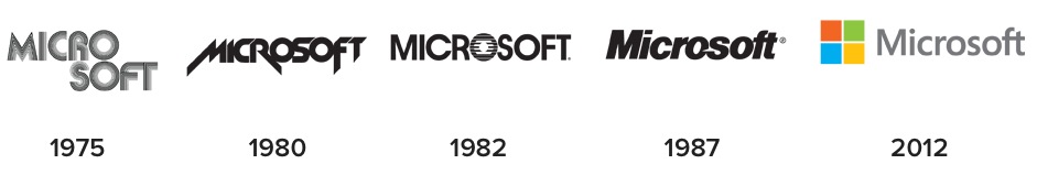
Out of interest, here is the full Microsoft logo evolution from the start to now:
