

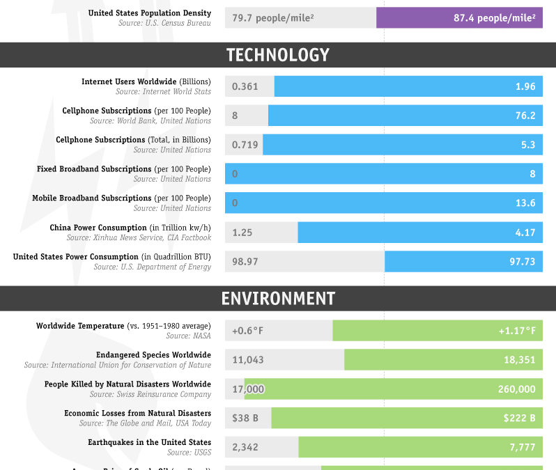
I picked this up on Twitter a few moments ago. I really think this is an excellent way to display some of the key changes in the world over the last decade.

Source: http://cache.gawkerassets.com/assets/images/8/2010/12/2000vs2010.jpg
By the way, if you like this sort of thing, I am sure you’d love Tim Harford‘s BBC radio show “More or Less”. On 31 December, he did a review of 2010 in numbers. You can listen to it at his site, or download the MP3 file here (13 Mb).
Good job making the Chinese and American power consumption comparable… How many kWh (and not kW/h) are a BTU again?
Good question. A quick Google search says:
One BTU = 1054 joules = 0.000 293 kWh
1000 BTU per hour = 0.293 kW
Is a quadrillion = a thousand trillion? (It’s a thousand million million)
And I am guessing the trillion here is an American trillion (i.e. one hundred million, rather than one thousand trillion).
If so, then to compare USA with China, you have:
America in Kwh:
* 2000: 28.99 trillion
* 2010: 28.63 trillion
China in Kwh:
* 2000: 1.25 trillion
* 2010: 4.17 trillion
Does that sound right? Probably.