

I’m not sure there can be anyone left on the planet who hasn’t been exposed to an infographic? Wikipedia describes them as:
Information graphics or infographics are graphic visual representations of information, data or knowledge. These graphics present complex information quickly and clearly, such as in signs, maps, journalism, technical writing, and education. With an information graphic, computer scientists, mathematicians, and statisticians develop and communicate concepts using a single symbol to process information.
But that’s the point. The above description is so tedious to read, and quite frankly extremely boring. Infographics take complex chunks of information and data and lay them out in a picture form, telling a story with images. Far easier to read and understand.
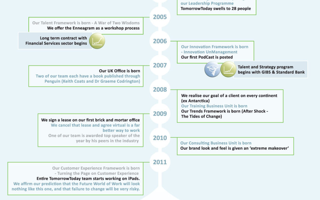
It was exactly that thinking that had us off to design our own infographic. I’d recently put together a 6 page document explaining TomorrowToday. We’d been sending it to our clients. The whole time I’d been uncomfortable that we were boring our clients and prospective clients to death. Who wants to read 6 pages of information about us? No matter how interesting it may or may not be.
So our ‘look and feel’ guru, Jude Foulston, got busy and turned 6 pages into an image. The 6 pages are always available for those who prefer ‘death by text’, but from now on it’s this one image all the way. Everything we say in our 6 pages sits in the images, icons and flow below.
For other infographic resource check these out:

Congratulations! I have in many ways been inspired by your creativity. Your newsletters help me to stay in touch with the world I am living in. Thank you
Missionary in Belgium